

![]()
Author’s composition.
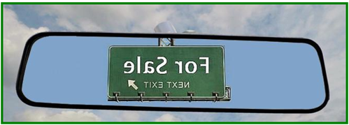
Two questions.
- Can you drive using just your rear view mirror?
- Can you figure out where home sales are going by looking backwards?
I thought that the answers to both questions would be:
- Not well, or not for long; or
- No, not really.
But maybe I’m wrong.
Last week, I observed (see Drawn and Quartered – Home Sales and Foreclosures) that seasonal factors plague monthly home sales – winter home sales are typically much lower than summers’.
As a result, everyone discusses home sales on a seasonally-adjusted-and-annualized basis. But foreclosure figures are not (yet!) annualized when announced. This understates the magnitude and impact of foreclosures. Foreclosures should be annualized, just like home sales, to put each on an equivalent basis
This week, John Burns suggests (see his Sales Headlines Are Misleading) that the seasonal adjustment process used to produce the home sales headline figures is not very robust, and may obscure more than it reveals. This is due to the variable impact of weather, holiday calendars, and the like.
To see the big picture, Burns suggest a simple fix for housing seasonals – use a 12 month rolling sum (not! average) of new and existing sales. Consider the following two charts, inspired by Burns’ analysis.
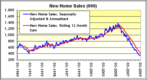
Figure 1: New Home Sales, Rolling Sum and Seasonally Adjusted & Annualized
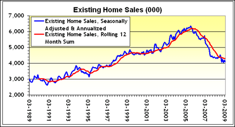
Figure 2: Existing Sales, Rolling Sum and Seasonally Adjusted & Annualized
The blue line in each of the above charts demonstrates the spiky irregularity of the “seasonally adjusted and annualized” home sales, and the red line is the “rolling sum” of the past 12 months of sales.
While the jittery “false positives” in the “seasonally adjusted” figures (see the blue spikes in Mar 2007) might briefly make news, Burns suggests that they should be ignored. Focus instead, on the meanderings of the rolling sum. These red lines will “signal” the bottom by flattening. Only then can we roll forward, and think about a recovery.
One last thing before I make my exit.
IF you are comfortable with the above methodology, then you might want to rethink the irrational exuberance that accompanied yesterday’s release, by the NAR, of their Pending Home Sales Index. As reported by Yahoo/Reuters on 4 May:
- WASHINGTON (Reuters) – Pending sales of previously owned homes rose for a second straight month in March … according to reports on Monday that suggested moderation in the long housing slump.
- The reports boosted U.S. stocks [DJIA up 214 points] and lent support to the view that the recession, now in its 17th month, was close to finding a bottom…
- The National Association of Realtors said its Pending Home Sales Index, based on contracts signed in March, rose 3.2 percent as first-time buyers waded into the market to take advantage of favorable prices and mortgage rates…
Below is a chart of the Pending Home Sales Index (“PHSI”), which has been produced by the NAR for only the last four years or so:
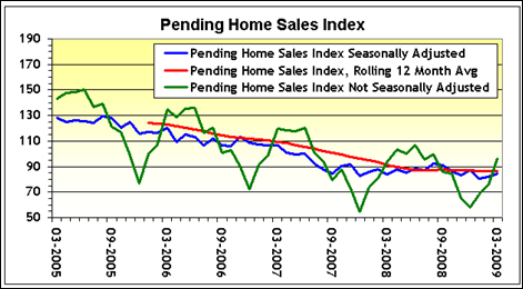
Figure 3: Pending Home Sales Index: SA, Rolling Average & NSA
This chart is similar to the prior two. The seasonally adjusted PHSI is in blue, and the rolling average of the non-seasonally adjusted pending sales is in red. I’ve added the “raw” non-seasonally adjusted pending home sales figure in green.
Given the variability of the pending home sales index (in either the raw or adjusted versions), relief at the rise in the seasonally adjusted (blue) PHSI seems a touch overblown.
If we were to apply Burns’ suggestion to focus on the red 12-month rolling figure (rather than seasonally-adjusted noise), it’s clear that there’s nothing really “new” in the 12 month, backwardly looking, version of the PHSI. Maybe the market should slow down a bit or pull over. There might be some sharp turns ahead.
- Note: Thanks to SoldAtTheTop, the proprietor of PaperEconomy, for the pending sales data. Don’t miss his take on yesterday’s pending sales release.
![]()
I used to work with numbers for a living. Time to rev up the engine and get back to the search for a new job, or at least my next idea. Till next time.


2 responses so far ↓
1 An Adjustment for All Seasons | Photomaniacal // May 7, 2009 at 10:48 am
[...] another great post, expert analyst Ira Artman demonstrates very clearly that although seasonal adjustment is a very [...]
2 Dagger // May 7, 2009 at 11:25 am
People are good a spotting patterns and trends, even purely imaginary ones. So we like a noisy signal. It helps us see whatever we want to see.
Leave a Comment