

![]()

© 2009 AP Photo/Noah Berger, Boston Globe, Scenes From The Recession - #30, 18 Mar 2009.
“Currently, the vast majority of banks have more capital than they need to be considered well capitalized by their regulators.”
- Treasury Secretary Timothy Geithner, Written Testimony Before Congressional Oversight Panel, 21 Apr 2009.
Forgive me, but where’s the news?
The financial market dislocation was NEVER a problem with the “vast majority of banks.” The problems were, and are, confined to the largest banks, as I described earlier in Follow The Money and A Little Off The Top.
For those that missed it, below are two of my charts from the latter post:
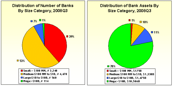
Figure 1: Distribution of Number of Banks & Bank Assets, 2008Q3, FDIC QBP
While the there been a couple of changes since 2008Q3 (a couple of arranged marriages … excuse me, mergers), the data have not changed much. The vast majority of banks – as noted in Follow The Money – are small and doing just fine, or would be if the rules weren’t rigged to benefit the big fellas.
As long as we’re “declaring victory” - I’d like to play. Ready? How about this one:
- There is nothing exceptional about the current mortgage and economic crisis, and conditions are pretty much what you would, or should, have expected.
To prove my point, I’ll need the following quarterly historical series, for the thirty-one year period of 1978 – 2008:
Item Description
- Freddie Mac Conventional Mortgage Home Price Index (CMHPI);
- Home Sales (New and Existing), Seasonally Adjusted and Annualized, From Census and NAR;
- US Owner Occupied Housing Stock, Census Bureau; and
- 30 Year Conventional Mortgage Rate, Freddie Mac Primary Mortgage Market Survey (PMMS).
Then, let’s do the following:
- #1: Transform CMHPI Index (Item #1) into annual, year over year changes. The CMHPI is similar to the more widely known FHFA/OFHEO index, but available for a longer period. It is a “repeat financing” index (either sales or refi transactions) of homes financed by conforming balance mortgages, ‘backed’ by either Fannie or Freddie.
- #2: Add New and Existing Home Sales (Item #2) to get Total Home Sales. Divide by Housing Stock (Item #3).
- This ratio, of home sales to housing stock, is a “quasi-turnover” measure and a general measure of the health of the housing market. Generally speaking, the higher the turnover, the better.
- #3: Smooth above two series as well as 30 Year PMMS rate using four-quarter averages. Plot separately (see below).
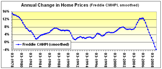
Figure 2: Annual Home Price Change, CMHPI
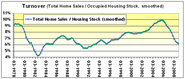
Figure 3: “Turnover”, Total Home Sales / Housing Stock
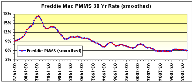
Figure 4: 30 Year Conforming Fixed Rate, PMMS
As the graphs below (Figure 5) indicate, there is a weak positive relationship between home sales and home prices, and absolutely NO relationship between mortgage rates and home prices.
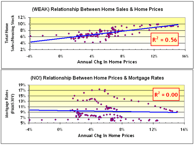
Figure 5: Relationship Between Home Prices and a) Home Sales; and b) Mortgage Rates.
- #4: Take the home price change CMHPI series (see Figure 2) created in Step 1. Subtract from it the interest rate PMMS series (see Figure 4) created in Step 3.
- Let’s call this “Carry”, since it equals the difference between what you make on your home (the asset), and pay on your mortgage (the liability). Like this:
CARRY = CHANGE IN HOME PRICES Less MORTGAGE RATE
- #5: Plot this CARRY and TURNOVER (from Step 2, see Figure 3) on the same chart, like this:
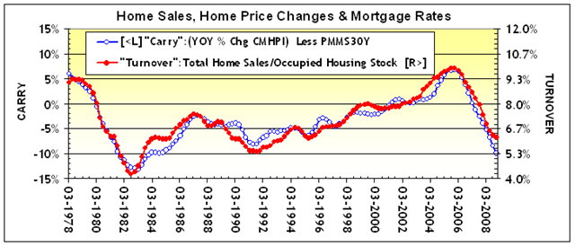
Figure 6: Carry (Blue, Left Axis) and Turnover (Red, Right Axis).
NOTE: Observe how closely the two series move together, almost perfectly in synch.
- Carry: ANNUAL CHG IN HOME PRICES Less MORTGAGE RATE
- Turnover: TOTAL HOME SALES / HOUSING STOCK
- #6: Plot CARRY and TURNOVER again, but this time on a scatterplot:
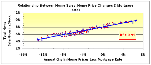
Figure 7: Scatterplot of Carry and Turnover, 1978 - 2008
Now that’s amazing! ‘Turnover’ (home sales as a percentage of the housing stock) and ‘carry’ (the difference between the change in home prices and the cost of finance the home with a mortgage) are, and have been moving, almost perfectly in lockstep! Pretty much like you should have expected. Market activity reflects, more or less, what you can make from the market.
Everything must be fine. I’m fine, you’re fine, we’re all fine.
Oh, and one more thing - the vast majority of banks are well capitalized.
There, don’t you feel much better?
![]()
I used to work with numbers for a living. Working as hard as I can to rejoin the working majority as I look for a new job, or at least my next idea. Till next time.


2 responses so far ↓
1 j // Apr 26, 2009 at 7:56 pm
The only thing I would comment is your mortgage interest rate comparison. Did you factor in the temporary nature of the loans (5 yr I/O usually) and the Option ARMs. If you are comparing apples to apples and not apples to oranges. Back in a normal real estate cycle, most loans were 30 yr fixed.
2 Ira Artman’s Sterling Slivers: The Smoking Gun – Subprime Underwriting and Prepayment // May 24, 2009 at 2:54 pm
[...] previously observed (No News Is … No News) that there is a tight relation between home price appreciation and transactions - IF you measure [...]
Leave a Comment